Staffing Request Form: Designing for Both Sides of the Hire @ The Home Depot
Role: UX Designer – Talent Acquisition Center (TAC)
Focus: Field hourly hiring — external candidate experience & hiring leader experience
Deliverables: Form redesign, pilot research, synthesis, recommendations, candidate view
The Context
The Talent Acquisition Center (TAC) team manages the external hiring process for field hourly associates across stores and distribution centers. My job was to think about both sides of that process: what the candidate sees, and what the hiring leader has to do to make it happen.
The project was the Staffing Request Form — the tool hiring leaders use to capture position requirements. Whatever gets entered flows directly into Candidate Self Service (CSS), where candidates review job details and decide if the role is a fit. That connection between the two experiences shaped how I approached everything.
The Problem
The existing form was outdated and hard to use. Hiring leaders — primarily ASDSs who manage HR responsibilities alongside their other duties — found it cumbersome. On the candidate side, the information in CSS was often incomplete or unclear, which hurt transparency at a critical decision point.
The goal: rebuild the form with transparency, accuracy, and a modern interface in mind.
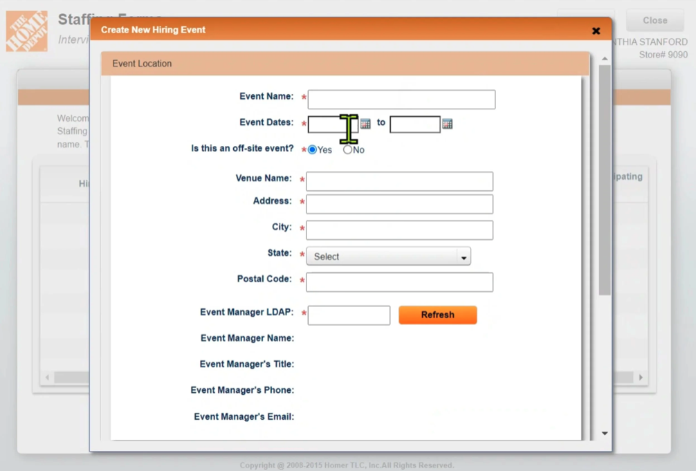
Yup, this is part of the old form.
The Approach
Designing the New Form
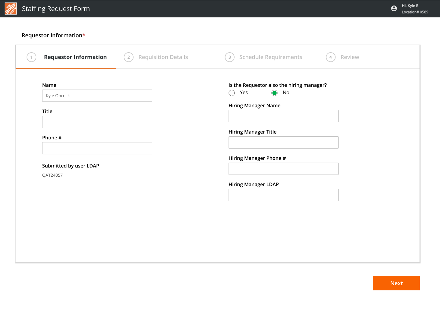
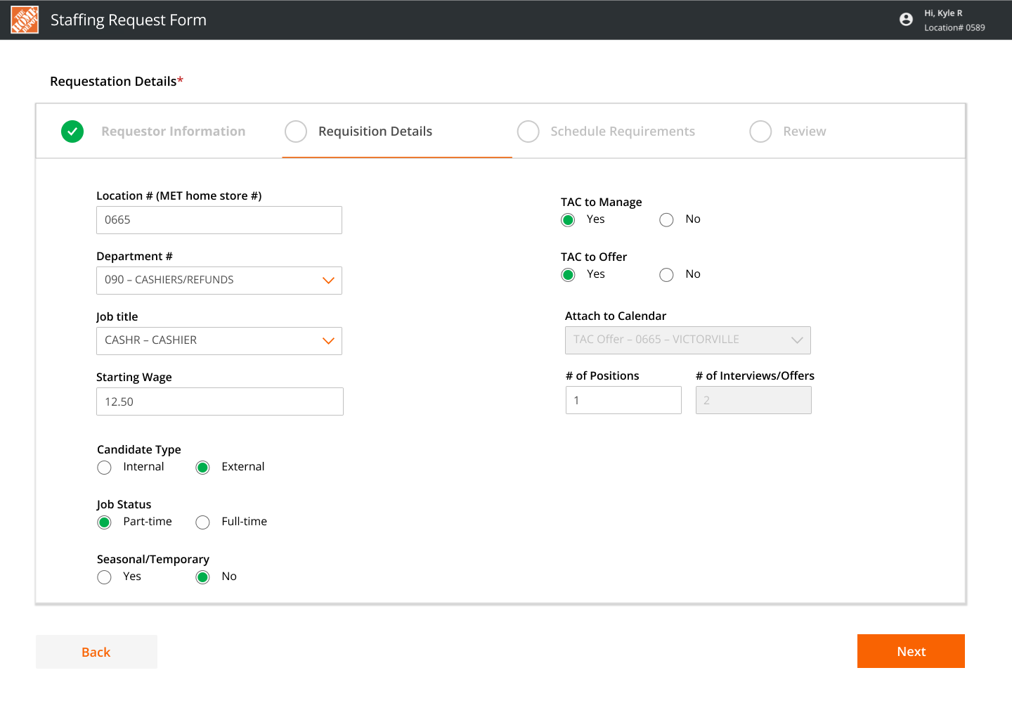
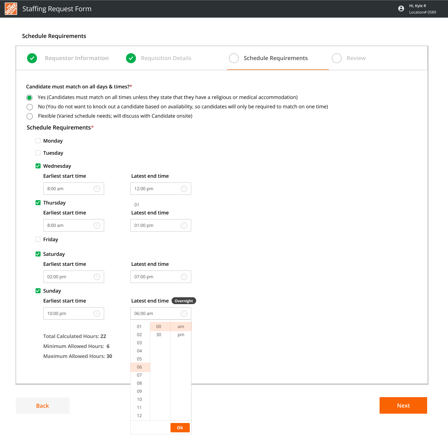
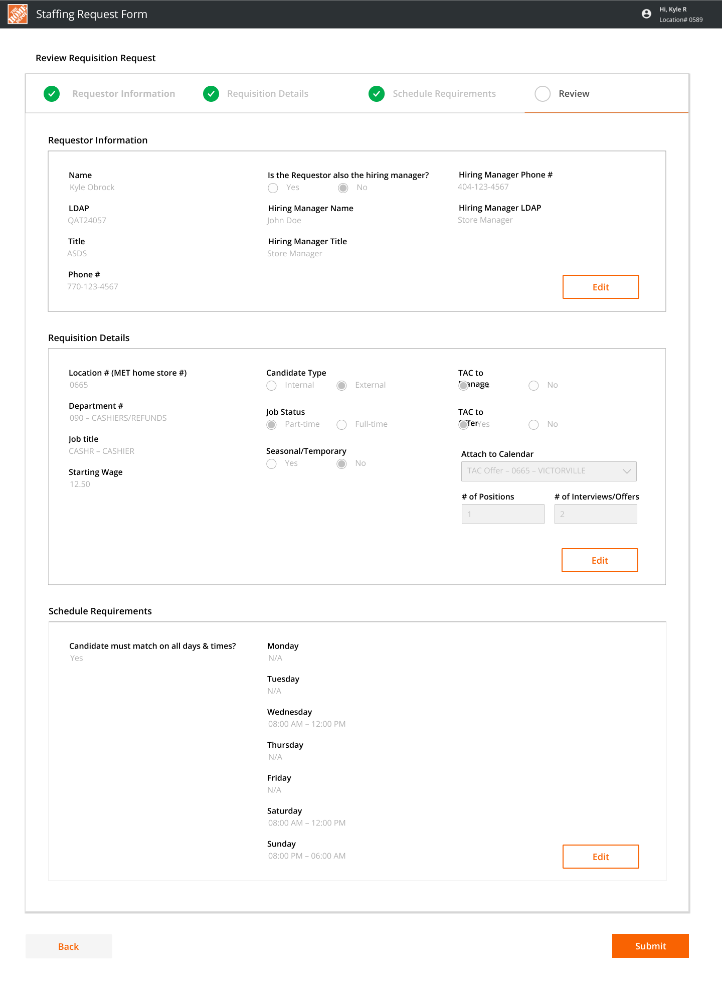
Starting with stakeholder requirements and the previous tool as a reference, I designed a structured multi-page flow that walked hiring leaders through each section of a position — from job details to the schedule that candidates would ultimately see in CSS.
A key addition was a summary/review page at the end, giving leaders a chance to catch mistakes before submitting. Errors here had a direct impact on what candidates saw.
The Candidate Side: CSS
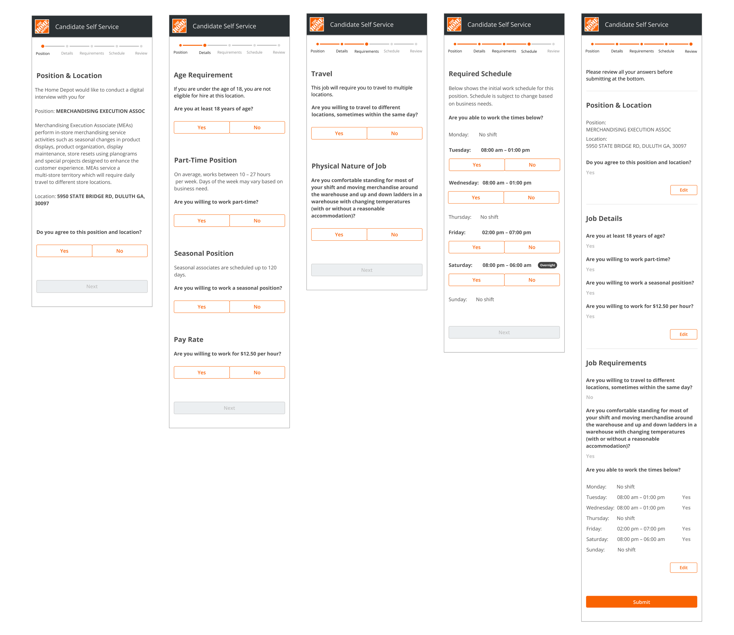
Everything entered in the Staffing Request Form surfaces in CSS — the candidate-facing tool where applicants confirm whether a role is a fit before moving forward. CSS walks candidates through five steps: position and location, job details, requirements, schedule, and a final review.
The schedule step is where the connection between the two tools matters most. If a hiring leader enters overnight hours incorrectly — say, a Saturday shift starting at 8:00pm and ending at 6:00am Sunday — that's exactly what a candidate sees when making their decision. Getting that right was a transparency issue as much as a design one.
Straight to Pilot
Due to timing, we moved directly into a large pilot across 100+ stores and distribution centers — real feedback from real hiring leaders in live conditions.
Post-Launch Research
After a few weeks live, I ran 1:1 feedback sessions with hiring leaders. I recruited participants by posting in a district's internal channel — seen by 328 associates — and ran sessions until spots were filled.
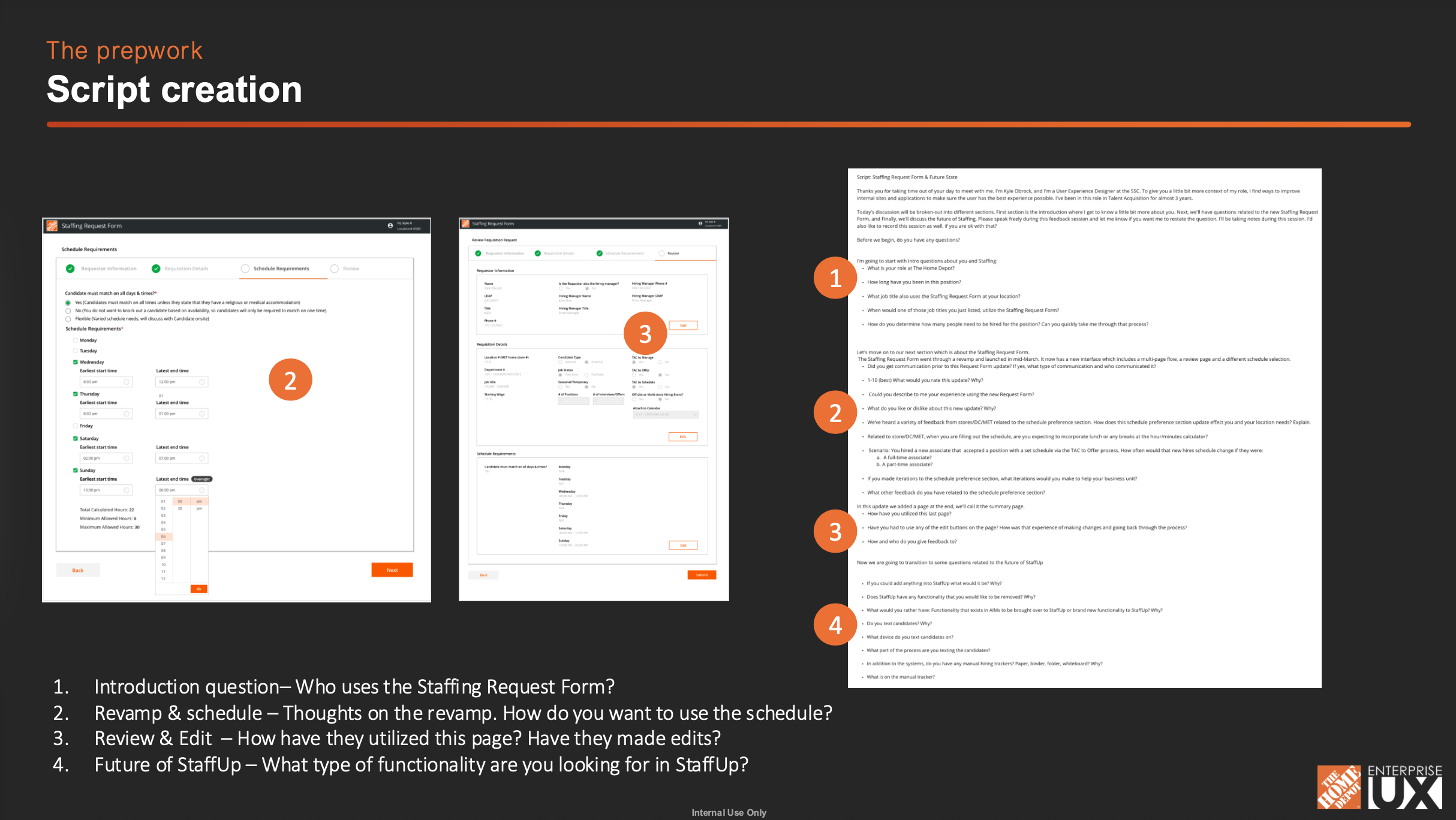
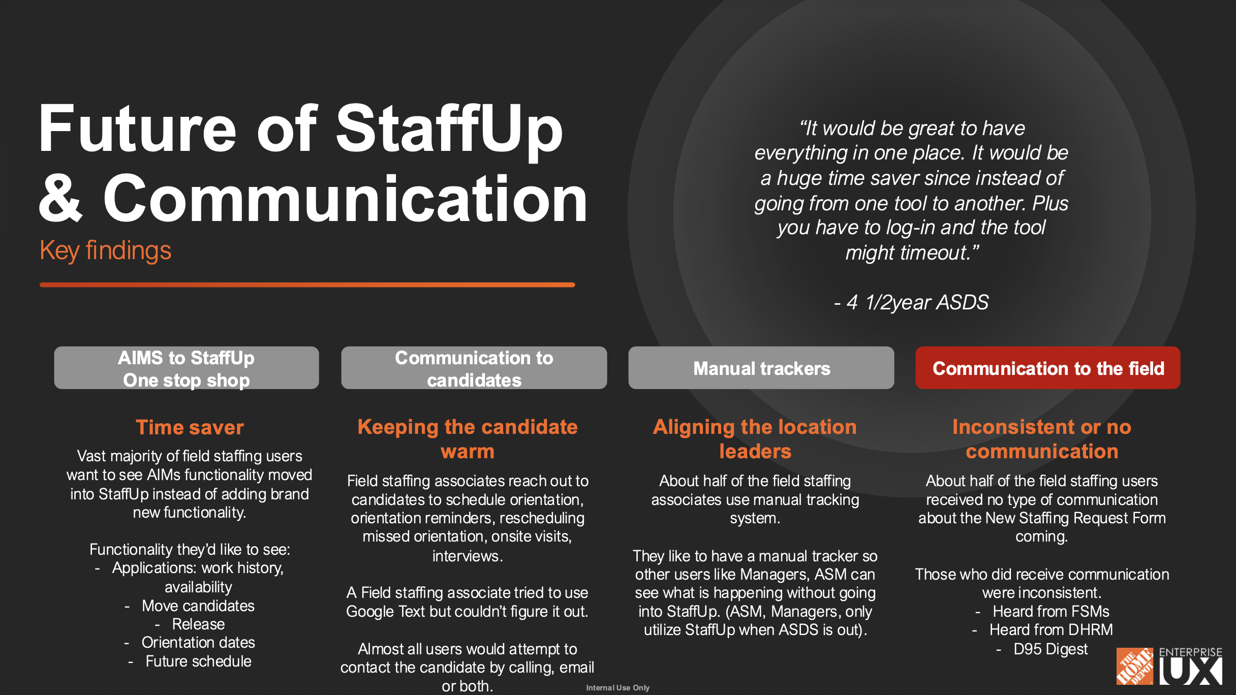
Sessions covered four areas: who uses the form and how, thoughts on the revamp and schedule section, how they used the review page, and what they'd want from StaffUp in the future. Participants included ASDs, HRMs, District Execution Managers, and HR Generalists across stores, DCs, and the MET team.
Notes from 1:1 user interviews.
Synthesis of research.
What the Research Revealed
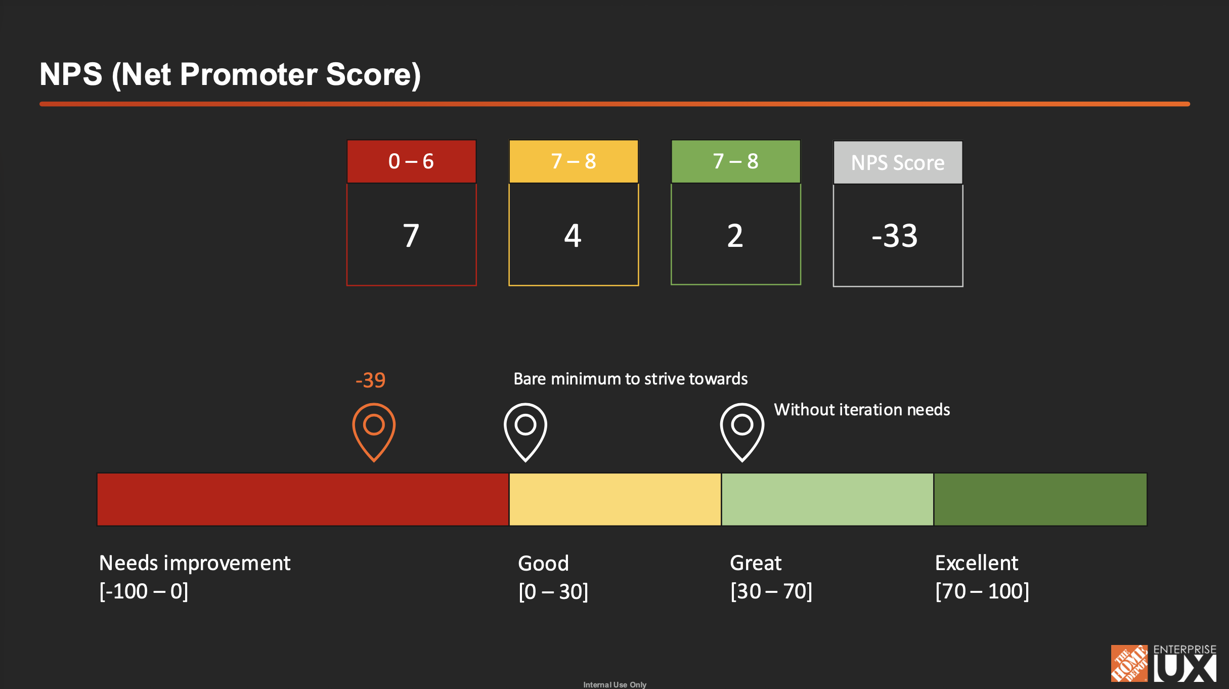
The NPS came back at -33 — a clear signal that specific areas needed work, particularly the schedule section.
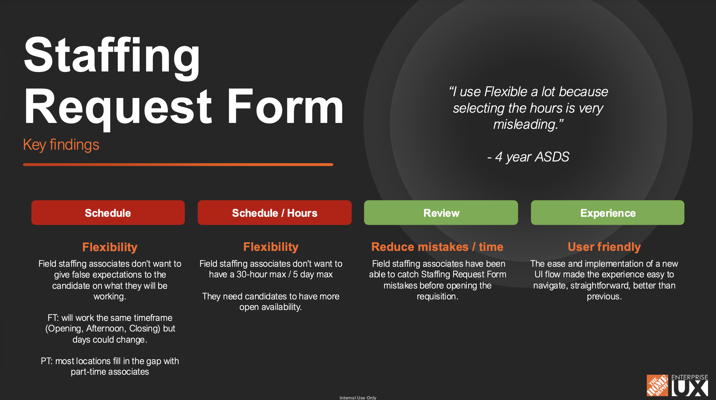
Schedule flexibility was misunderstood. Hiring leaders were defaulting to "Flexible" as a workaround because selecting specific hours felt misleading.
"I use Flexible a lot because selecting the hours is very misleading." — 4-year ASDS
Hours caps were too rigid. The 30-hour/5-day max didn't reflect how staffing worked in the field. Leaders needed candidates with more open availability and the form wasn't letting them communicate that.
The review page worked. Leaders were catching mistakes before opening requisitions — exactly what it was designed to do.
The new UI was an improvement overall. Easier to navigate than the previous tool. The friction was with specific components, not the concept.
Half the field didn't know the update was coming. About half received no communication before launch. Those who did hear about it got it through inconsistent channels. A rollout problem, not a design problem — but it affected perception.
Recommendations & Outcomes
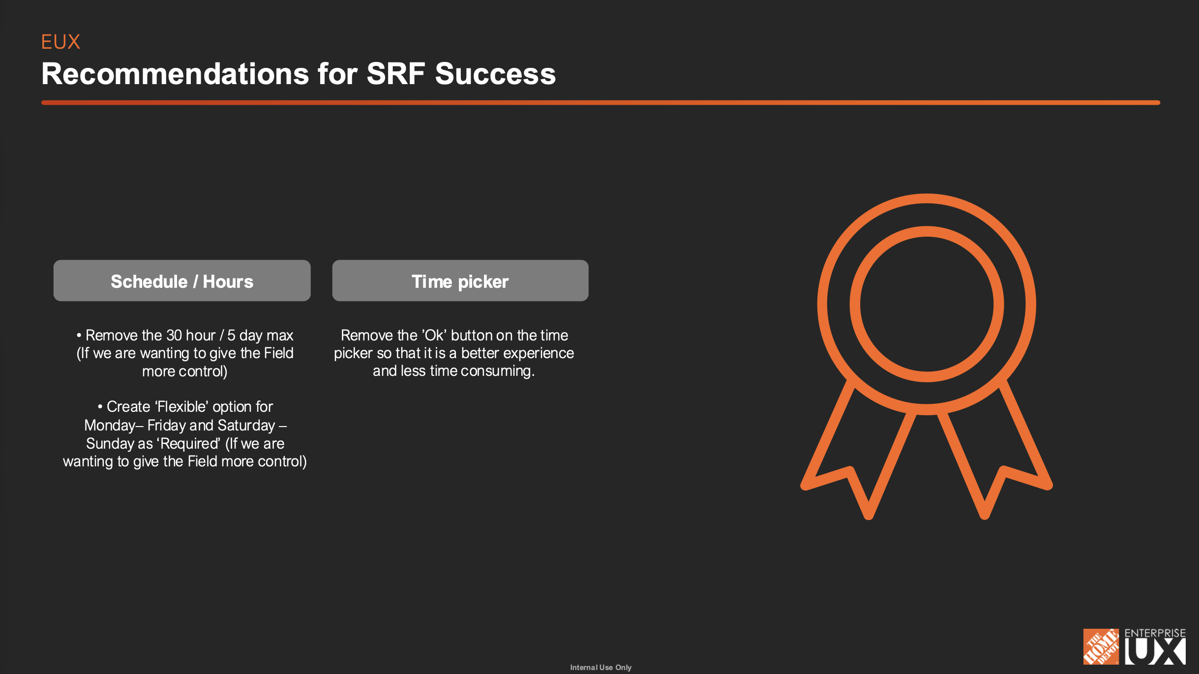
After synthesizing the research, I presented findings and recommendations to the team:
Remove the 30-hour / 5-day max to give field leaders more control
Add a "Flexible" option for Monday–Friday and Saturday–Sunday as a "Required" setting
Remove the "Ok" button from the time picker to reduce friction
Several changes were prioritized for implementation. The time picker fix directly addressed one of the most commonly cited frustrations in the schedule section.
What Made This Project Different
The Staffing Request Form isn't candidate-facing — but every design decision had a candidate-facing consequence. A hiring leader who can't accurately capture a schedule creates a candidate who accepts a job with the wrong expectations. That's a retention problem before day one even starts.
Getting that connection right was the core challenge throughout.