One Designer, Three Teams: UX Across Workforce Management @ The Home Depot
Role: Staff UX Designer
Teams: Workforce Management – Workforce Tools (WFT), WorkforceHQ (WFHQ), Timepunch
The Context
Workforce Management (WFM) at The Home Depot was built across three distinct product teams:
Workforce Tools (WFT) — the associate-facing mobile app for field hourly associates (store, DC, MET). A one-stop shop for schedule viewing, shift exchanges, time off requests, pay slips, call outs, and more.
WorkforceHQ (WFHQ) — the leader/manager view, showing who's working, clocked in, clocked out late, missed shifts, and handling coverage when someone calls out.
Timepunch — focused on the digital time clock at each location, and eventually the digital badge experience for punching in and out via WFT.
When WFM launched, there were four UX designers supporting these teams. Over time, through budget shifts, layoffs, and company priority changes, I became the only UX designer across all three.
How I Made It Work
Supporting three product teams meant working with three different PMs, three different engineering leads, and their supporting engineers — all with competing priorities and timelines.
To manage this, I introduced quarterly UX priority meetings — bringing together managers, PMs, and engineering leads to align on how to share my time across teams. Each quarter we'd review the roadmap, t-shirt size the UX work, and make intentional decisions about level of effort. The key question in every session: do we need research first, or are we confident enough to move straight to design? We were honest about the tradeoffs and documented the risks when we moved fast.
This wasn't just a scheduling exercise — it was a way to make sure UX had a voice in prioritization, not just execution.
We’d go through a Kanban of WFM UX work.
Feature Spotlight: Xchange
The Problem
Associates in field locations often need to pick up extra shifts or give away shifts they can't work. Before Xchange, this happened informally — posted shifts next to the punch clock, managers playing middleman, or shifts simply going unfilled. There was no system for it.
Associates were telling us: "I don't care what the shift is, I just need money." That's a retention signal. If we could give associates a way to pick up extra hours at their own location — and eventually at neighboring stores and DCs — we could reduce the financial pressure that drives people to look for other jobs.
What I Designed
Xchange is a shift marketplace inside WFT. Associates can browse available shifts at their location, filter by date, and pick up shifts they're qualified for. Qualifications matter — if a shift requires equipment certification, it simply won't appear for associates who don't have it.
The flow works in two directions:
Picking up a shift — An associate browses the Xchange Market, selects a shift, agrees to the terms, and submits for manager approval. Once approved, it appears in both their My Xchanges tab and their Schedule.
Offering a shift — An associate goes to their schedule, taps Offer on a shift they can't work, and agrees to terms acknowledging they're still responsible for that shift until another associate picks it up and a leader approves it.
How We Worked
Because of resource constraints, we ran a focused design sprint with multiple iterations as a balanced team rather than a full research-first process. We launched an MVP, then went back to improve the experience based on what we learned in the wild — an honest tradeoff that let us ship faster while still closing the loop.
The Strategic Vision
The current version of Xchange is scoped to an associate's home location. The longer-term vision is to expand the marketplace to neighboring stores and distribution centers — giving associates who need extra hours a broader pool of opportunities. That vision shaped design decisions from the start, making sure the architecture could scale without a full rebuild.
Building for Scale: Component Style Guide
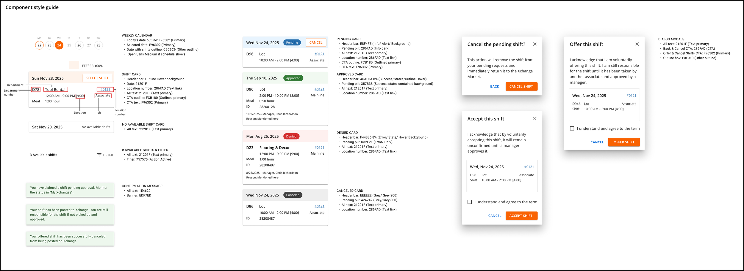
As the sole designer across WFM, I built a component style guide for Xchange and Schedule to ensure consistency across states and handoffs to engineering. The guide covers shift card states (pending, approved, denied, canceled), color tokens, typography, confirmation messages, calendar components, and dialog modals — everything a developer needs to build without guessing.
Feature Spotlight: Time Off Request (TOR)
The Problem
Field hourly associates rely on Time Off Request to manage their work-life balance. But the existing experience was confusing and frustrating. Associates had to submit one day at a time — no date range selection, no ability to add context to a request, no way to edit after submitting.
Discovery research from January 2025 made the pain clear:
"I don't like that you can't pick a date range for time off. It's really frustrating to have to add one day at a time."
"It's unclear when you get what options based off the date. The options should be the same regardless of the date."
100% of associates interviewed wanted a comment box to add context to requests
86% wanted to input specific times instead of using the duration field
57% wanted the ability to edit a request after submitting
What I Designed
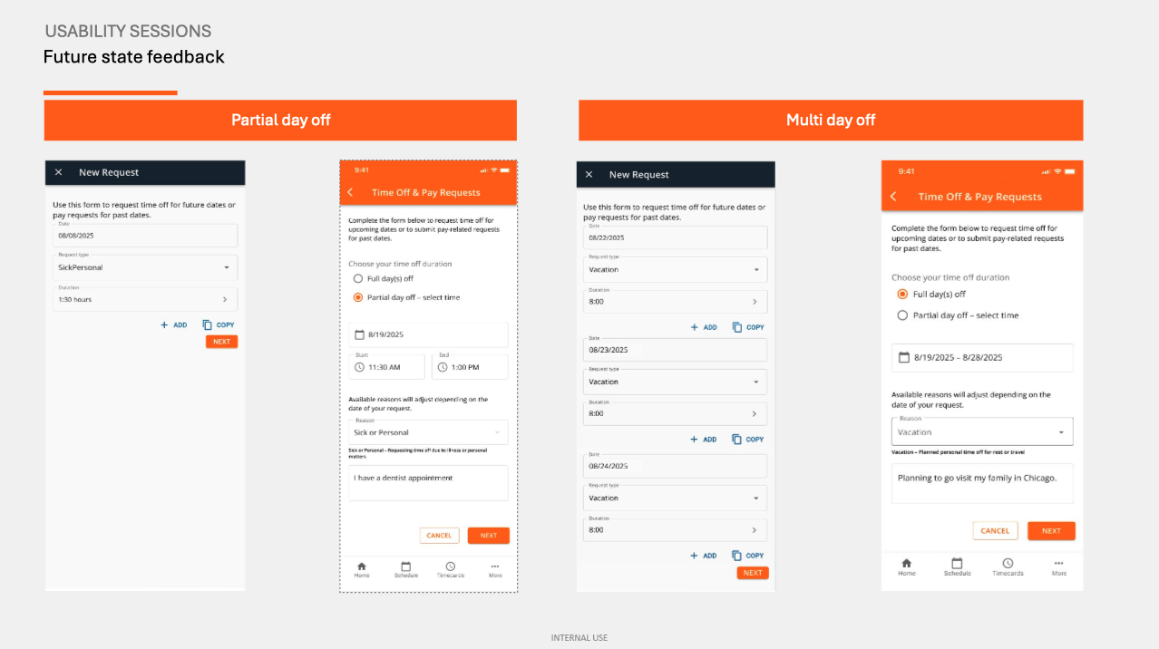
The redesigned TOR introduced date range selection, a comment field, specific start/end time inputs, and a cleaner calendar interaction. The goal was to make the experience feel as intuitive as any consumer app associates were already using on their phones.
I ran usability sessions comparing the current state against the future state prototypes, using the UXUM Lite scale to measure the experience.
The Results
The numbers told a clear story:
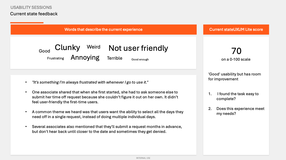
Current state UXUM Lite score: 70/100 — "Good" but with significant room for improvement. Associates described the experience as "clunky," "weird," "annoying," and "frustrating."
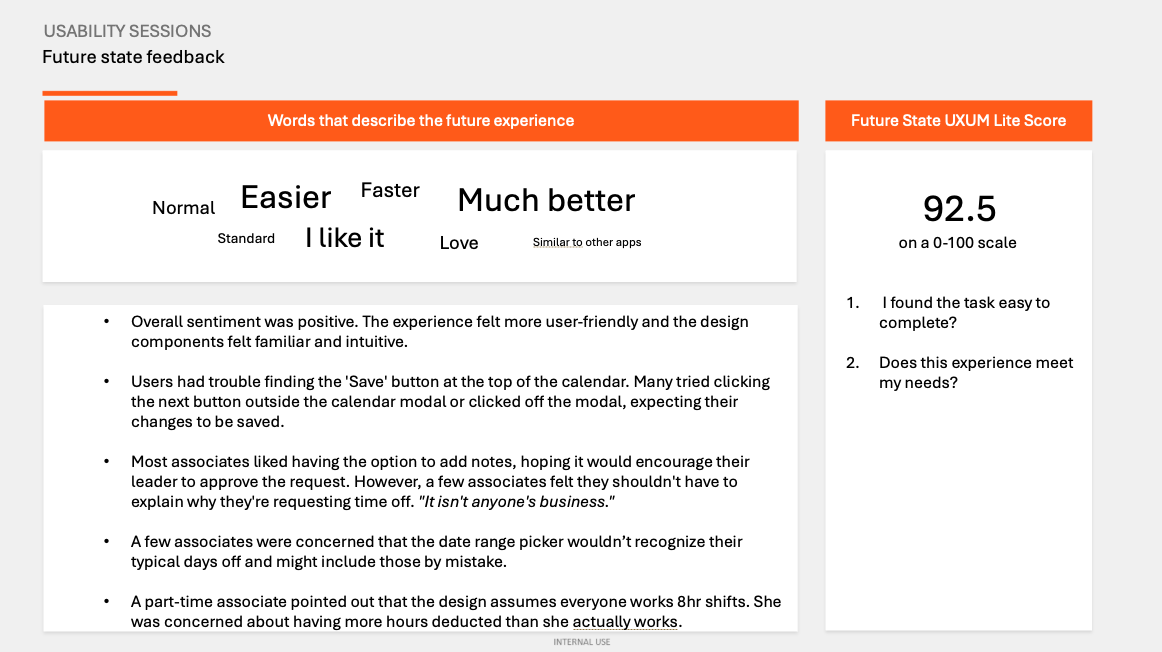
Future state UXUM Lite score: 92.5/100 — Associates described the new experience as "easier," "faster," "much better," and "similar to other apps."
That's a 22.5 point improvement — a meaningful jump driven by specific, research-backed design decisions.
Usability sessions also surfaced new considerations for iteration: the Save button placement inside the calendar modal was easy to miss, a few associates felt they shouldn't have to explain their time off, and part-time associates noted the design assumed 8-hour shifts which didn't reflect their reality. Those became the next set of refinements.
The Bigger Picture
What made this chapter of work interesting wasn't any single feature — it was the challenge of being one person responsible for the UX quality of an entire product suite. That meant making hard calls about where to invest research time, building systems (like the component guide and the quarterly prioritization meetings) that multiplied my impact, and staying close enough to three different teams to know when to push back and when to move fast.
At the start of the 2026 Fiscal Year, I was moved to a new priority to support the Home Services space.